
A favorite color palette really sets the tone for your wedding celebration. It has the power
to define a mood and exemplify a persona. Are you feeling blue? Green with envy? Red
Hot? Whatever the mood, Pantone, can point you in the right direction.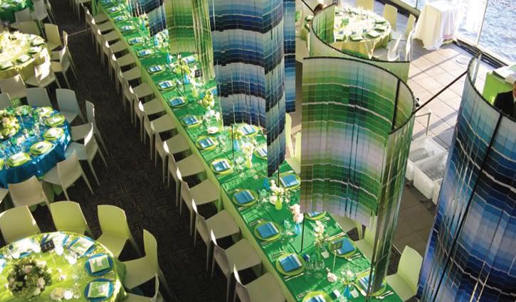
Ask any Stationary Designer, Florist, Art Director, Interior Designer or Event Planner
who Pantone is and they will tell you; Pantone, Inc. is the world's color authority.
Pantone provides design professionals with products and services for colorful
exploration and expressions of creativity. Talk about creativity, I just love the way
Event Planner, extraordinaire, David Stark, used the blue and green Pantone color
swatches to decorate the event shown above.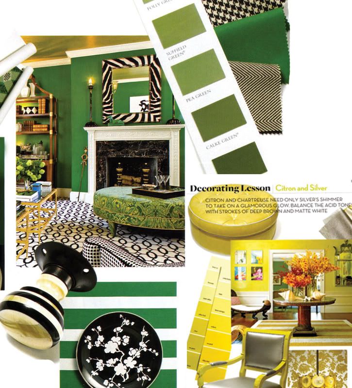
(above: color inspiration from House & Garden magazine. To see how some
amazing bloggers are using the green and black color combo , check out
Jennifer Skog's bridal shower and Erin's inspiration board for her upcoming
baby shower)
Color selection may seem like a daunting task. But the truth is, you don't have to be
a design professional to absorb ideas. In addition to the tons of bridal magazines that
are all over your coffee table, pick up the latest fashion or interior design magazine for
inspiration. Wedding colors are reflective of hot colors in interior design and current
couture fashion. Above are pages taken from House & Garden magazine. (I'm so sad to
hear that this magazine will cease publication next month, it was always a constant
source of inspiration for me).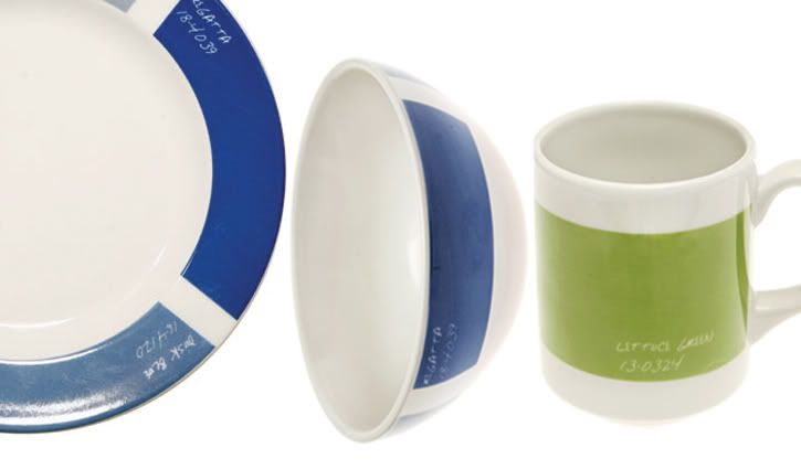
(above: Dusk blue side plate, $4.98; Dusk blue cereal bowl, $4.98; lettuce green
10 oz. mug, $3.98; all available at Fishs Eddy).
Selecting a color theme for your table is a lot like choosing a color palette for your
wedding, you're limited only by your creativity. Pantone brings its color expertise
to the table and their Palette tableware collection allows you to mix and match colors
to suit your own individual style.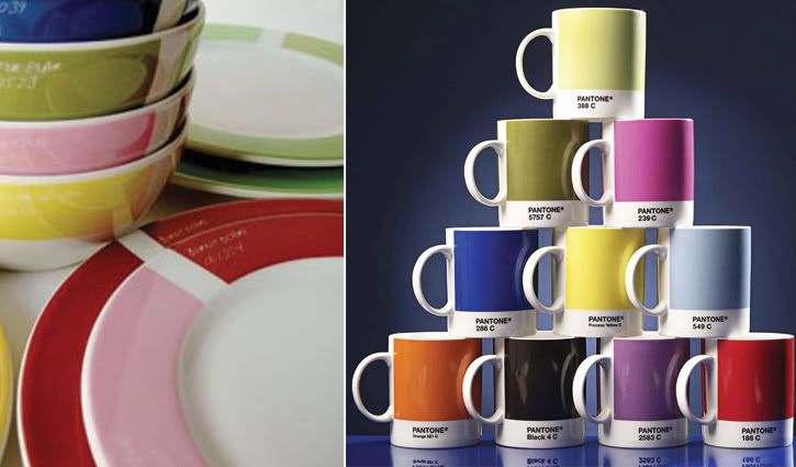
(above: Palette collection available at Fishs Eddy; Family of pantone mugs, all
10 colors, 72 pounds, W2).
Just remember, there's a fine line between tasteful and tacky so don't overdo it with a
theme or color. Knowing when to say when is key!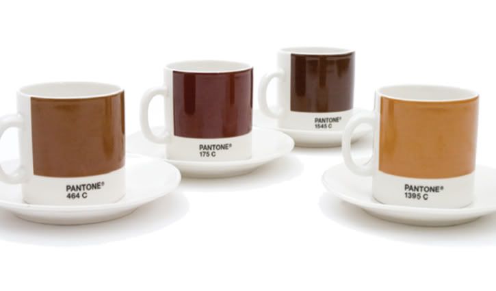
Wednesday, November 7, 2007
I Love Hue!
Subscribe to:
Post Comments (Atom)


13 comments:
Great post Sarah. I too am so sad about H&G. That photo of the green room is exactly the color green I go nuts over.
Lovely post as always Sarah! I love the green wall from H&G. Thank you for all the great ideas. I will make sure to get my mom blogging about shower details and post pictures in January.
what a wonderful idea from pantone!
r.
which issue of H&G magazine are those pages from? thanks!
Anne, I'm so upset about H&G, I just can't believe it! Just when the issues were starting to get "really" good, they go and pull the plug! I love that green as well...Do you have that paint color? If so, who is the manufacturer?
Erin, congrats again on the baby! I can see already, that the shower is going to be fabulous. Can't wait to get more info from Mom! I'll be tuning in to Lucky Baby to get the scoop.
Thanks Randal for stopping by!
Hi Lindsey, it's the "Special Issue: Color Trends" - March 2007.
This was a fantastic issue - - - "New ways to use color", "How to mix bolds and neutrals", "Make a Pale Palette interesting", were just a few of the articles in this issue.
I can't express how disappointed I am that this magazine is folding!
The blue and green combo is absolutely gorgeous - I could SO take that and run for a wedding!
Elizabeth
http://elizabethannedesigns.com/blog
Sarah - I have that green, black and white in my file as well. I just pulled it out the other day to check out those pulls - they are amazing.
Blue skies and green grass - - - you need to only look at nature to understand why this color combination works so well!
Elizabeth, I invite you to check out a post that I did on this fabulous combination. Check it out:
http://toastandtables.blogspot.com/2007/10/who-what-ware-tablesetting-inspiration.html
I'll be tuning in to see what you decide.
Cheers!
Sarah
Mrs B. wasn't that one of the best issues of the year! The color combinations that they featured - - - "tangerine and stone", "pink and brown", "green, black and white"; these were all great. BUT NOTHING BEATS that fabulous "purple and gray"! All I can is - - - stayed tuned!
How cute are those pantone cups- never seen anything like that before!
I love the hues you picked to share!
Post a Comment